RUBI
The City’s real-estate registry
The RUBI application (Registro Único de Bienes Inmuebles) was created in 2010 to manage, supervise, and audit the properties and assets of the government of the Ciudad Autónoma de Buenos Aires across the country.
Client
Government of the City of Buenos Aires
Role
UX Lead
Time
8 months
Stakeholders
Property Directorate, IVC Directorate, Concessions Directorate, Relocations Directorate, Notary Office, among others.
Executive view
The case at a glance
As UX Lead, over 8 months I redesigned with the team the RUBI 2.0 experience for the Government of the City of Buenos Aires: from a legacy system that was hard to use and out of line with the Obelisco guidelines, to a more fluid product for managing, supervising, and auditing real estate. We split the work into three phases, through an MVP and an evolutionary phase. Impact was measured as a 50% increase in productivity and a 50% reduction in task execution times.
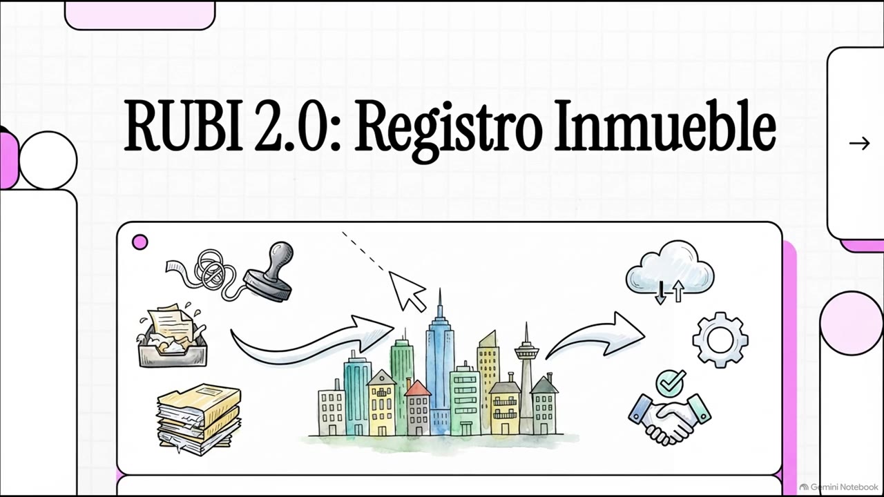
Summary
Choose a language to play
Generated with NotebookLM from an explanatory case brief. It does not include personal data, deeds, or sensitive client or signer information.
Productividad
↑50%
Increase in productivity.
Tareas
↑50%
Reduction in task execution times.
Satisfaction
NPS 4 / 5
Customer satisfaction and an increase in product usefulness.
01 — Context
A single registry for the City’s assets
The RUBI application (Registro Único de Bienes Inmuebles) was created in 2010 to manage, supervise, and audit the properties and assets of the Government of the Autonomous City of Buenos Aires throughout the country.
Administered by the General Directorate of Asset Administration, this digital tool plays a crucial role in coordinating, proposing, and intervening in the policies, standards, and procedures related to the management and disposition of real estate in the city.
Primary users
RUBI’s primary users are government officials who perform diverse roles and therefore need different levels of access to the application. These users come from key departments such as Real Estate Assets, Concessions, Relocations, and Notarial.
The challenge
Challenges and objectives
Over the years, the legacy application faced significant challenges. The user experience was inefficient and lacked a user-centered approach, which made interaction clumsy and unfriendly. The user interface also did not reflect the government’s style guide, known as Obelisco.
To address these problems and improve the usability of the application, stakeholders requested a complete redesign not only of the user interface, but of the entire experience, including at the engineering level, together with the development of new features and capabilities. The goal was to create a friendly, transparent digital product that would optimize the property-management process, making users’ daily tasks more fluid and efficient.
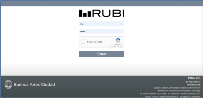
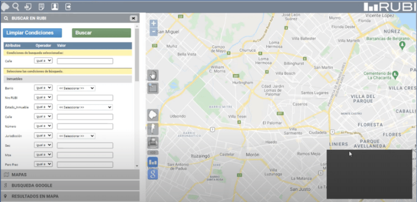
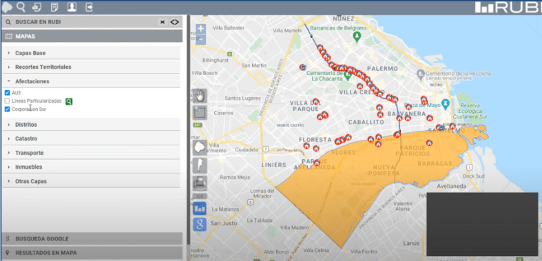
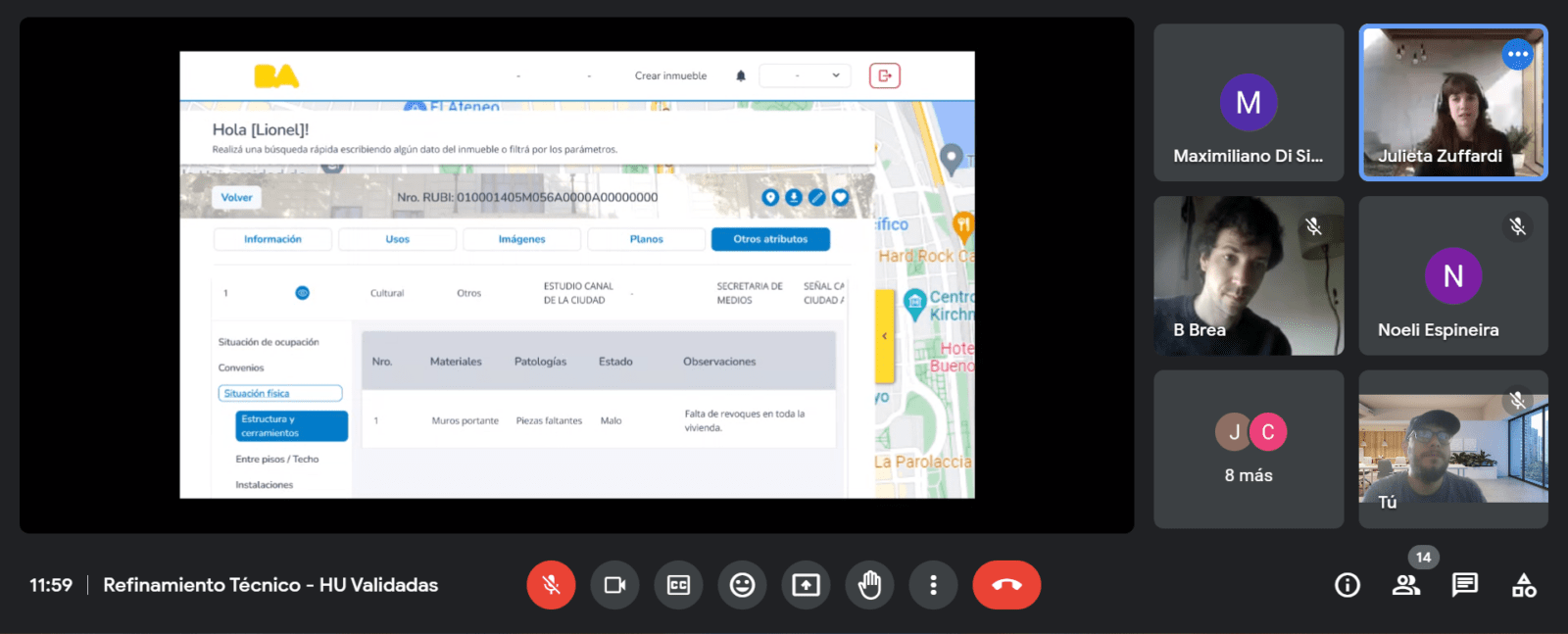
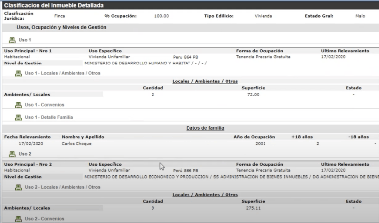
These are some screenshots of the original RUBI system (sorry if they look blurry; they are captures from our research).
As you can see in them, technological obsolescence and the lack of a meaningful user experience were, without a doubt, the most important points to improve.
In the previous screens, the user ran queries through a form. The map performed incorrectly, often returning other data, erroneous data, or system technical errors.
In this case, the forms have no logical architecture, and all the data sat on the screens without logic or concatenation based on a structure.
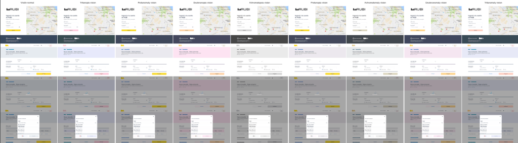
02 — Process
Understanding the scope of this tool from the start
Initially, we carried out an exhaustive assessment that included meetings with users to discuss the purpose, features, and scope of the tool. The main goal of these sessions was to obtain a detailed analysis of the importance, scope, and effort involved in creating new software that would evolve from RUBI 1.0 to RUBI 2.0, both functionally and technologically.
In this context, we created an assessment document covering the current state (AS IS), the stakeholders, a survey of existing features, a diagnosis of identified problems and improvement areas, and the transition from current processes toward the ideal ones. The document also included a prioritization matrix, standards, and technology recommendations.
Ver Assesment — For confidentiality reasons, I chose to trim the original file to show only part of this assessment.
Pain points
The pain points identified in the user experience of the RUBI application revealed significant gaps that affected the system’s efficiency and usability. These challenges were key obstacles that had to be addressed to improve the user experience and optimize the property management process.
01
Datos desactualizados
The presence of outdated or inconsistent data made information inside the system less accurate and less reliable, which could lead users to make the wrong decisions.
02
Nomenclaturas
The lack of uniformity in nomenclatures and the lack of alignment with the city’s urban code made searching for and managing properties effectively more difficult.
03
Critical alerts
The absence of alerts warning about critical situations could result in inaction or in inadequate handling of urgent problems related to properties.
04
Integration
The lack of integration with external systems that contained relevant information limited users’ ability to access the data needed for complete property management.
05
Roles and editing
The lack of view and edit levels according to different roles and profiles made personalization and efficiency in property management more difficult.
06
Unnamed streets
The ability to register a property under “unnamed street” led to identification errors when several records shared the same house number, which affected data accuracy.
07
Actualizaciones masivas
The lack of tools to perform bulk data updates efficiently resulted in a manual, tedious process that consumed time and resources.
08
Concesiones y relocalizaciones
The absence of relevant information on concessions and relocations limited a complete understanding of the properties’ situation.
Tres fases
Our team was ready to take on a new challenge
After the client reviewed the analysis and approved working with us through the commercial team, we were ready to start immediately and move forward with prioritizing user stories.
We agreed to split the project into three distinct phases:
Fase 1
MVP
Implement basic functionality such as login, the home page, and property creation.
Fase 2
Core
Evolutionary in nature, it focused on the core of features, such as the security, administration, and search module, along with other add-ons.
Fase 3
Complementos
Also evolutionary, it consisted of incorporating secondary features that enriched the user experience.
Prioritization and mapping
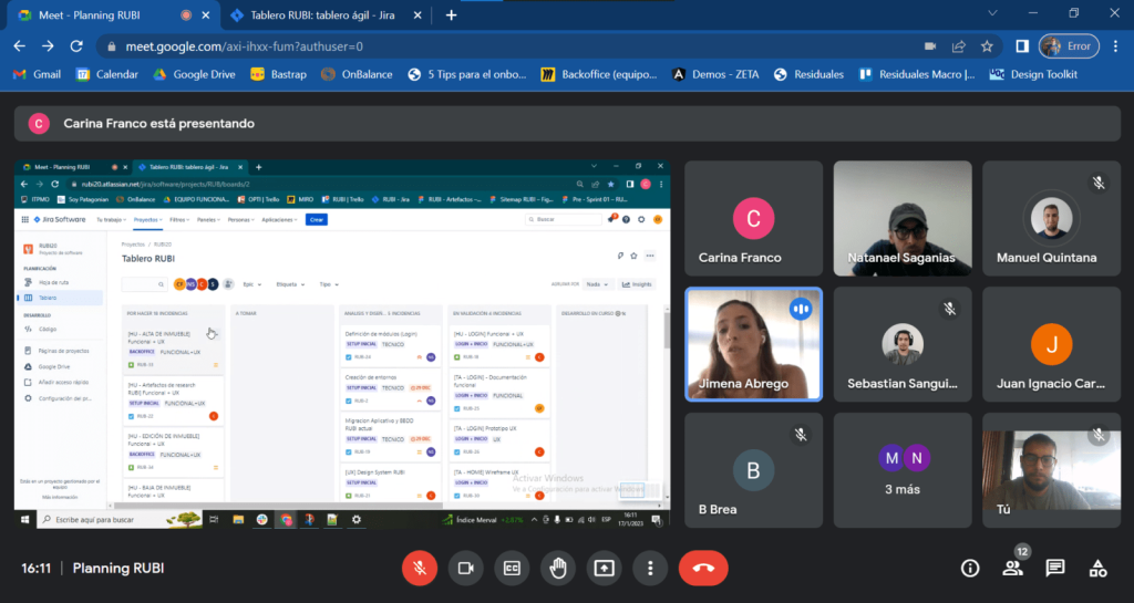
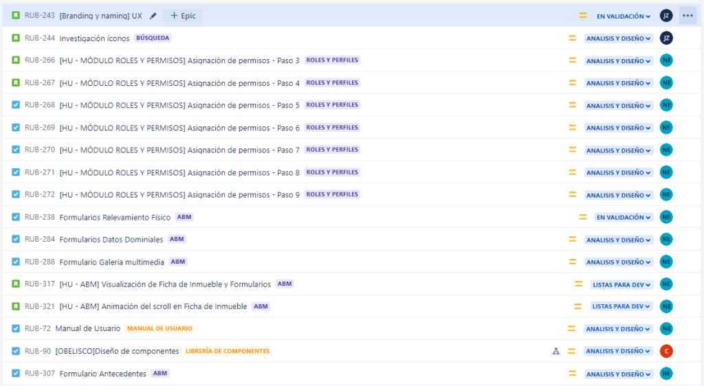
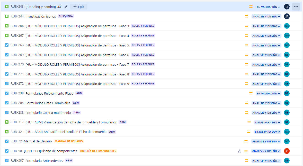
After prioritizing tasks with the product owner, we planned sprints and quarters, prioritizing the full product backlog we had loaded in Jira.
View prioritization matrix
With all the details organized, we set out to complete an exhaustive mapping of the system.
Ver mapeo completo
The full picture of the system
Starting from the end…the complete picture of the system
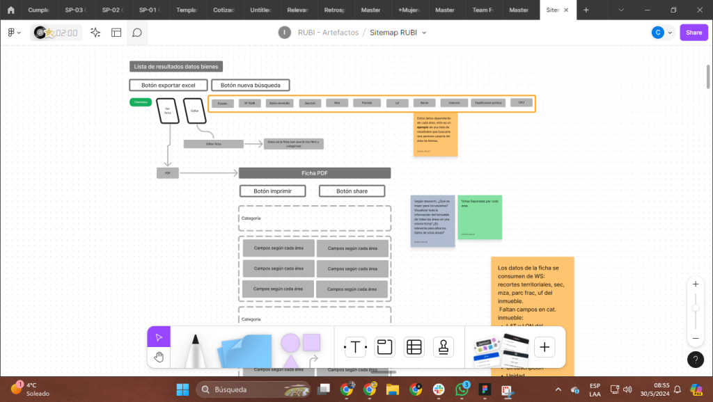
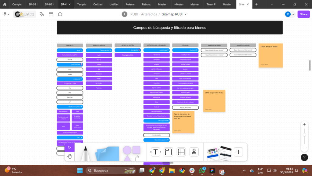
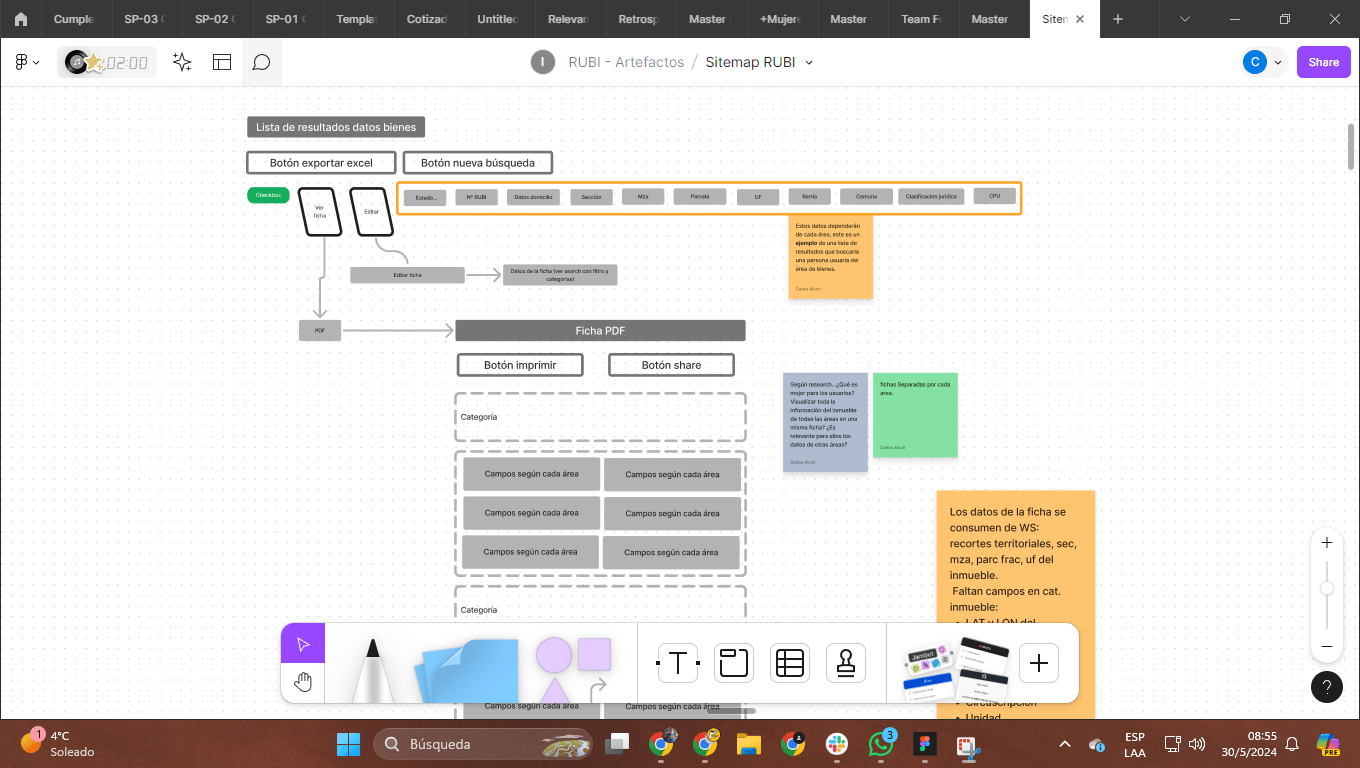
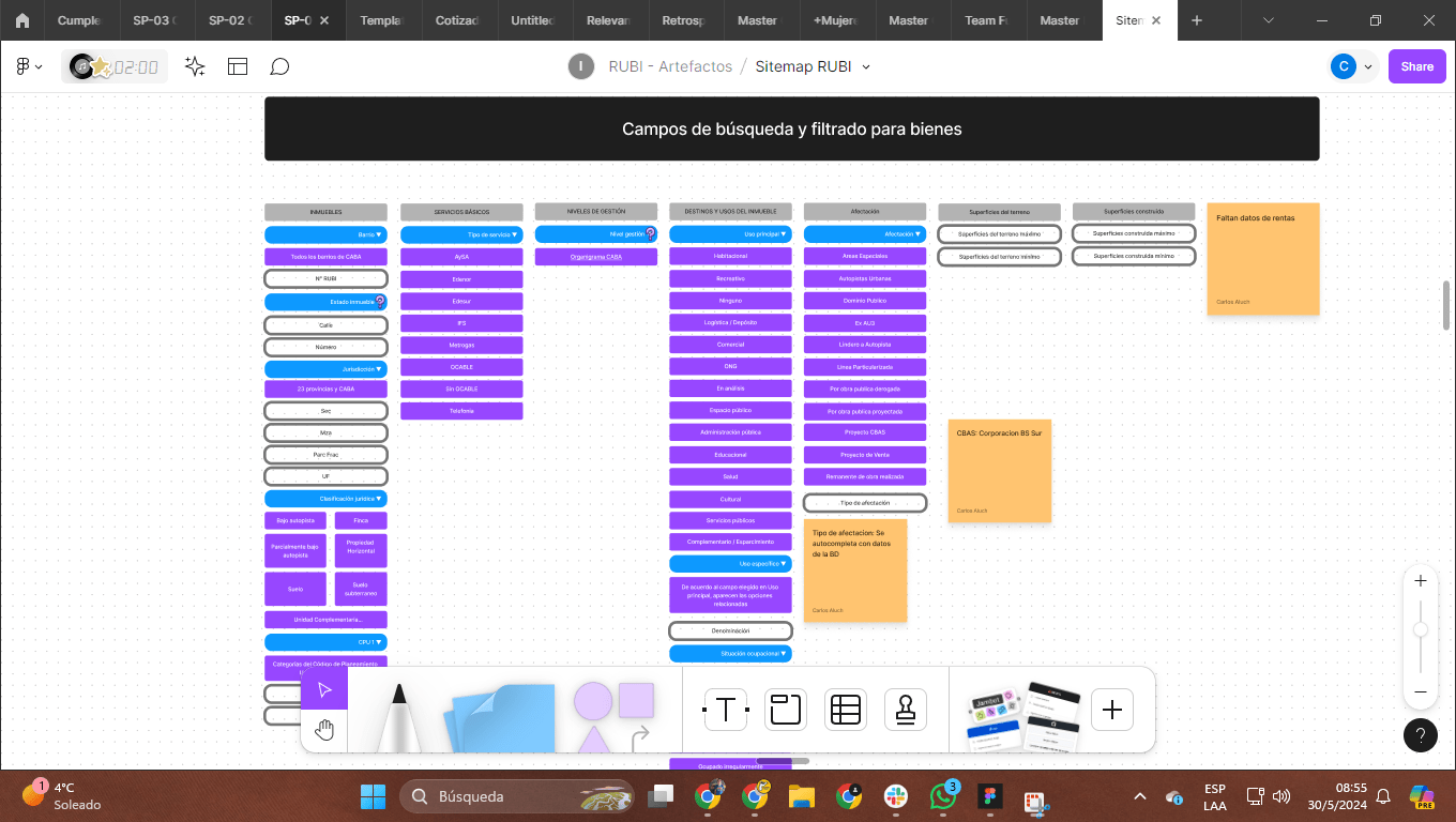
Using a mapping artifact as the main tool, the team set out to meticulously chart every path users would follow throughout the system.
From login and possible use cases through full exploration of the system, every connection was documented in detail. The challenge was clear: design a fluid experience that would let users reach their destination in no more than three clicks from the starting point.
Once this navigation map was produced and validated by key stakeholders, we dove fully into developing the previously prioritized user stories. That approach let us focus on the most important areas and ensure every aspect of the system was aligned with end users’ needs and expectations.
Trabajar ordenados
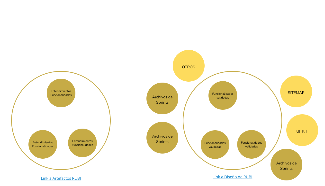
Working in an organized way was priority number one. Working organized, with an artifact structure, is vital to me. While in each designer’s different workspaces I leave room for creativity and new proposals, I believe having an artifact structure was one of the things I worked toward in my past—optimally.
To that end, my strategy with the team was simple:
01
Sprint files
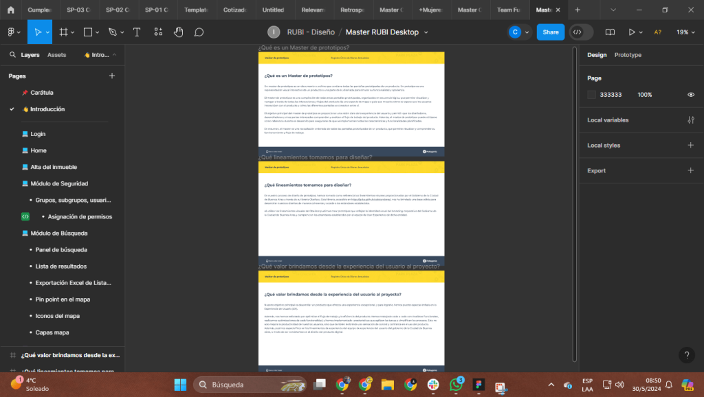
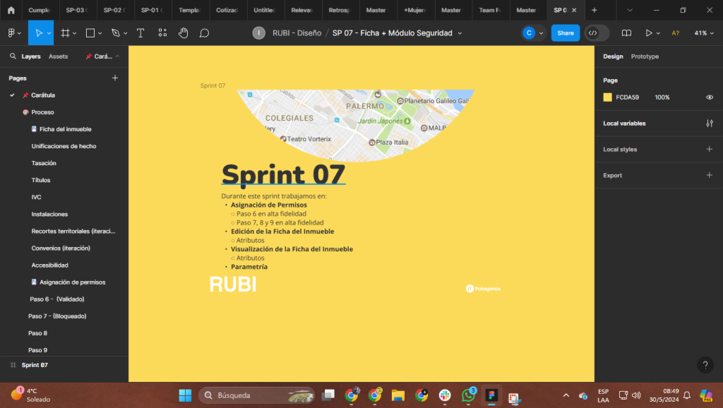
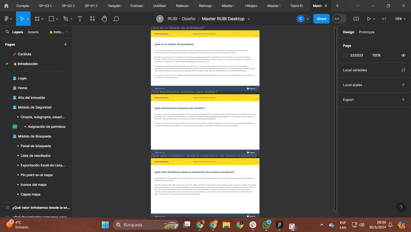
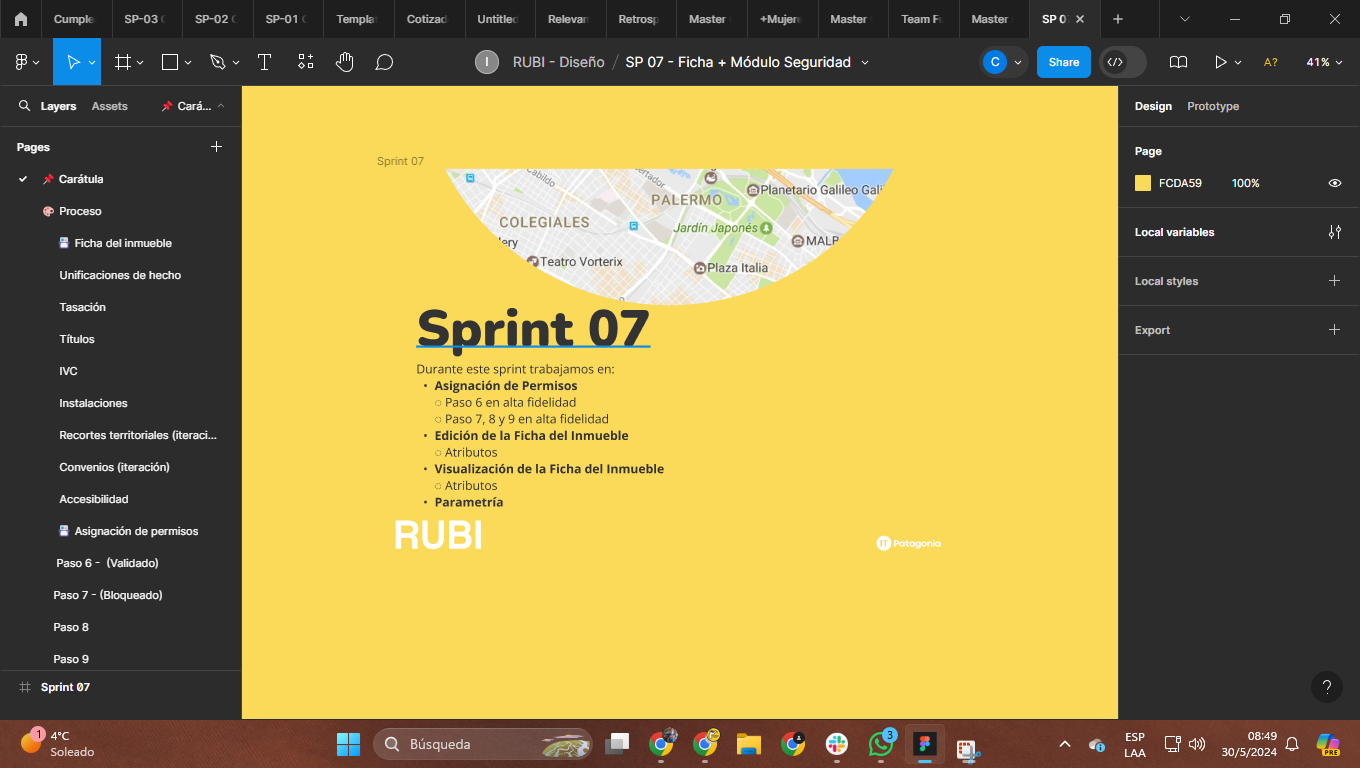
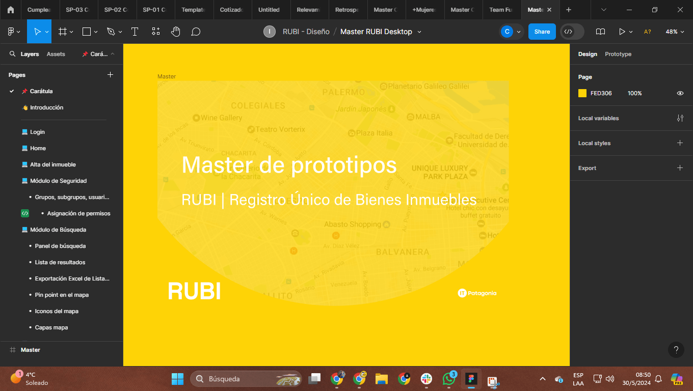
Understanding artifacts, prototypes, and everything generated from ideation and prototyping in each sprint should live in files named SP_01/02/03/and so on. That is where we would keep the full mountain of ideas. The file should include a cover and an index of the user stories taken in that period. In turn, each story should be laid out across Figma pages.
02
Prototype master
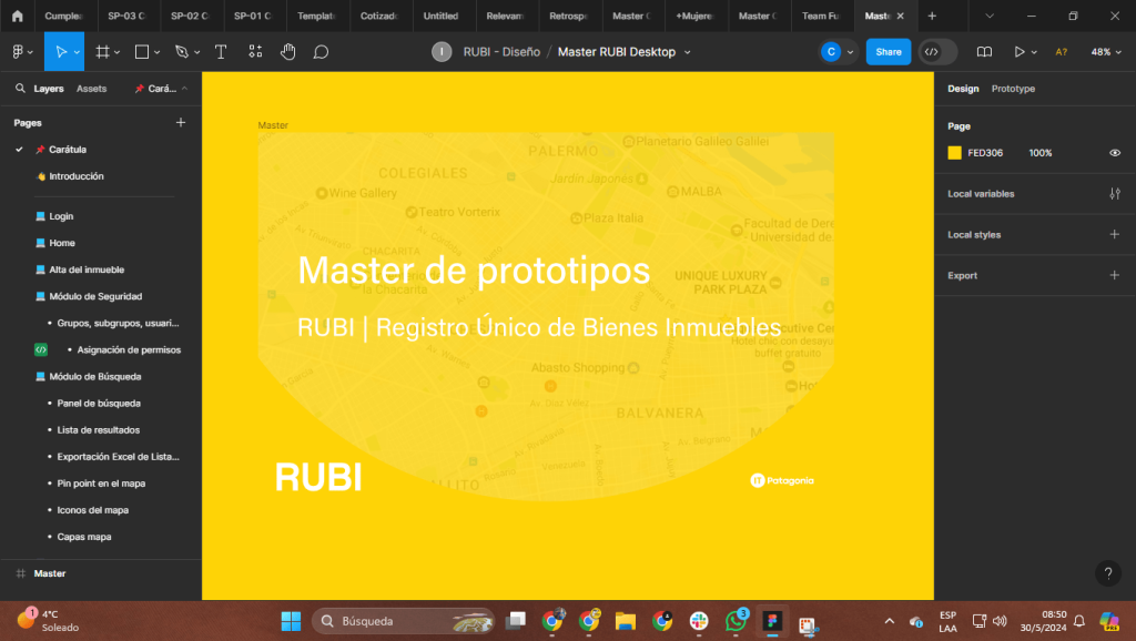
Once prototypes were validated, place them in a central file called Master. From there, everyone involved in the project could consult it. Like the draft files, the Master had to include a cover, an index, and then all the stories or flows involved.
03
UI KIT
If a UI Kit had to be built from scratch, generate the file and name it properly, also adding the corresponding usage documentation and conditionals for when to apply it. In this particular project, the design system was already built by the client, with all of its specifications.
Accesibilidad
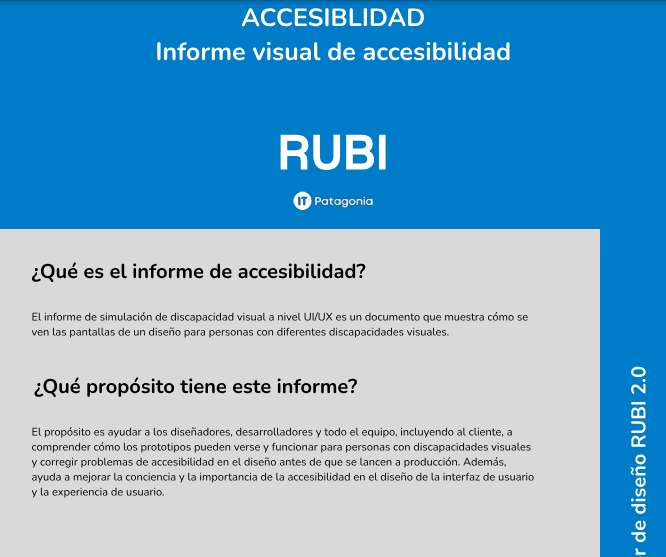
Adding more value to the product by designing accessibly from the start. Beyond working in an organized way, an important differentiator was that every user could use this tool, regardless of permanent, partial, or temporary conditions. That is why, as a team, we agreed to take design seriously from conception through validation—always keeping accessibility front and center.
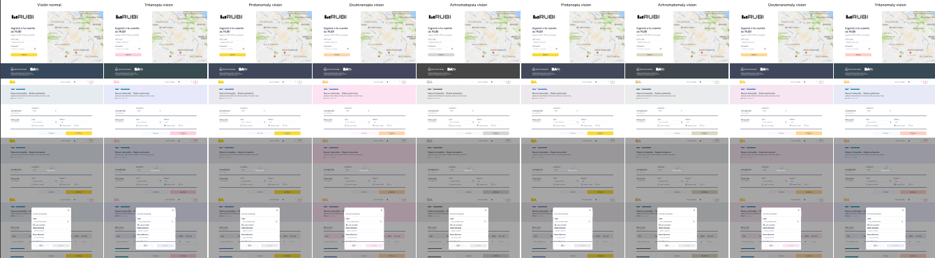
Although commercial terms and priorities meant we could not apply everything we had originally planned as improvements (screen readers, high contrast, etc.), we were able to apply a large share of techniques to our designs, such as audits through Figma plugins that let us analyze, find gaps, and iterate accordingly. We also used a contrast-ratio calculator to evaluate every design layer. Together with development, we promoted labeling the code with ALT parameters so that, in the future, people could read content whether or not they used a built-in reading tool.
03 — Product
Llegamos al MVP acordado
At this point, there was little to highlight besides our team’s excellent ability to meet the established deadlines. We successfully completed the first phase of this project, delivering the requested experience as planned.
Still, had our work really ended after a demo with users? That is where a crucial stage in the project’s evolution began. Even if the first phase was complete, there was always room for continuous improvement and optimization. User feedback from the demo could reveal opportunities and additional needs we had to address in later phases of the project.
Fase dos ongoing
Our move into stage two would be consolidated by presenting stakeholders with the minimum viable product we had built in phase 1. With the client’s confirmation to keep working with us, we embarked on a new stage.
The process was repeated following a well-established sequence:
01
Prioritize
We met with the product owner to prioritize user stories, making sure we focused on the most critical features and characteristics that would add value to the project’s success.
02
Roadmap
We built a detailed roadmap that mapped the project’s course for the next steps. That meant carefully planning milestones, assigning the talent chosen for this project (they continued from phase 1), and setting realistic timelines for each development phase.
03
Ejecutar
Once everything was in place, we launched fully into action. With a solid plan and our team’s renewed commitment, we were ready to take on the challenges ahead.
Forms
Everything was going well until… Everything was running smoothly; our team had been collaborating for more than four months. From the start, we not only achieved strong performance but also built a cohesive identity. Through activities such as team-building sessions, UX Jams, and UX critiques, we forged the synergy this ambitious project needed.
During the initial phase of the project, however, we identified that one part of the system could pose significant challenges: the forms. As if it were a premonition, that is exactly what happened. When we reached the forms section, the team hit a blocker. It also took time to align the product owner’s expectations around form functionality, which caused delays in the project.
That is when I stepped in. With a team eager to solve the challenge of visualizing up to three levels of forms in a single view, the task was enormous. We started by tackling key questions: How should it work? What is the ideal outcome? Who are the users and what are their needs? How much time do we have? What other solutions exist in the market? This approach gave us a holistic understanding of the forms functionality.
With all of this information on the table, we dove into analyzing the different scenarios through userflows and two-way matrices. That allowed us to break the information down to a very specific level of detail.
In the end, the design was a natural outcome of this collaborative process. The product owner’s positive reaction in validation meetings was proof that our approach worked. We solved a problem that had been affecting the team not only in terms of compliance, but also given the project’s tight deadlines and the client’s strategic importance to the company.
Design and development
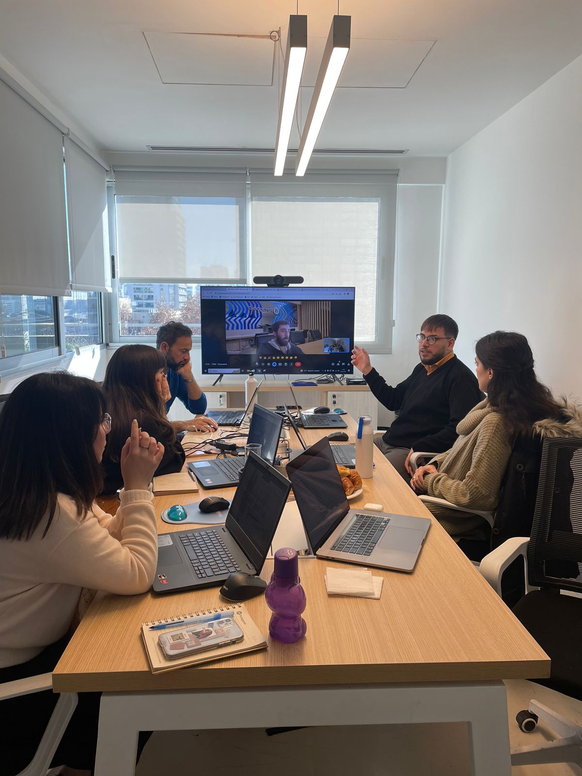
Working shoulder to shoulder with developers is the best thing that can happen to a designer
Designers and developers are often not on the same wavelength. I cannot explain exactly why this happens, but it is a common industry pattern for both teams to work independently. A close relationship between the design team and the development team, however, can be a strategic advantage that should not be underestimated.
From the start, I set out to work closely with the development team. That challenge was not easy, especially because the designers had no prior experience working directly with developers; in fact, they had had bad experiences with them in previous jobs.
To close this gap, I had to devise an effective strategy. After careful planning, I implemented a series of practices that proved to be key:
01
Weekly
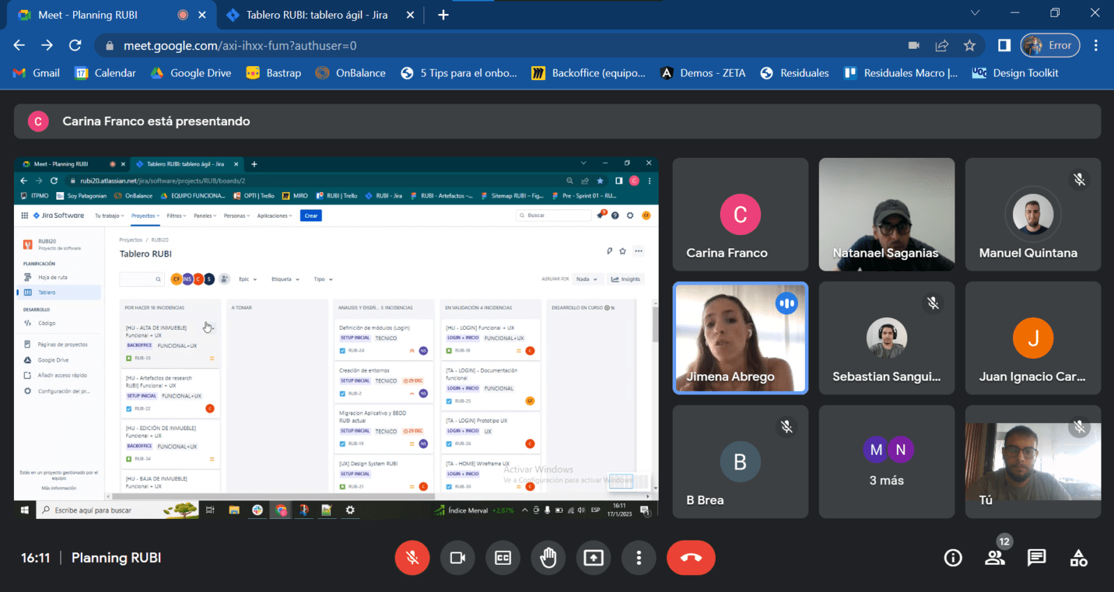
We organized weekly one-hour meetings with the development team, where both teams could raise questions and concerns, fostering open communication and the exchange of ideas.
02
Technical handoff
We implemented a technical handoff process for all user stories validated by the product owner. This included creating detailed technical and visual documentation, as well as on-request meetings to discuss any relevant aspect.
03
Slack
We enabled Slack communication channels dedicated to discussing the viability and feasibility of specific components or interactions, allowing continuous dialogue between the design and development teams.
One team
These simple practices were fundamental to strengthening our relationships and aligning our goals. From then until the end of the project, our teams worked as one, with a single objective in mind: meeting the client’s needs, both in development and in user experience.
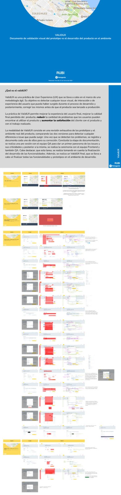
ValidUX
ValidUX, a word that reflects a great body of work
In previous experiences, we often found ourselves testing the build in the environments to make sure everything worked as planned in the prototyped experience. That task, however, was usually just a quick review, not a formal activity within the process.
I decided to change this and formalize the task so my team could carry it out more systematically, always respecting the established plan and finding suitable moments for it within the daily routine.
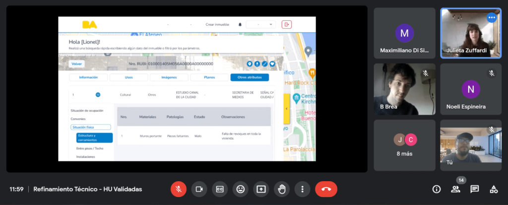
Before we started, we agreed with the Quality Assurance (QA) team to run a visual and interactive review, and we coordinated with the development team to address any issues found afterward. Once the procedures were in place, we got to work.
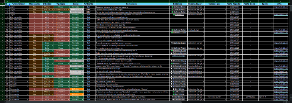
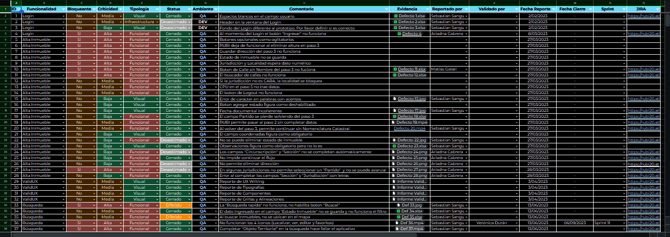
Using a spreadsheet, we began recording every functional and visual inconsistency we found, categorizing them and providing clear solutions to fix them.
Once we finished this process and made the necessary corrections, the product’s value became clear. Every detail, from a simple icon to a title or an input field, was examined and fixed. That meticulous attention to quality showed in how the product was perceived, which proved exceptionally positive during the client demo — and the client was, incidentally, demanding about details. Teamwork had paid off, and the final product stood out for its quality and attention to detail.
Wrapping up the tool
The team successfully completed all of its assigned hours. Despite minor setbacks related to understanding and designing the RUBI forms (more than 10 in total), the team showed a strong ability to use quieter moments and focus on less complex stories, thanks to the coaching I provided. That kept us on track and allowed us to meet the established deadlines.
By the end of the project, all of the work had been designed and documented exhaustively. Every detail had been recorded and analyzed, ensuring that the final product met quality standards and the client’s requirements.
The final detail for this project (Spoiler: part two is in progress).
To wrap up the project, and because we had a couple of hours left in the plan, we decided as a team to give this project a finishing flourish.
To do that, outside the sprints (our involvement had recently ended), and with reduced capacity, we took on shrinking the user manual into a quick onboarding guide so every user could get into the product quickly.
On the other hand, a short promotional and onboarding video that would let users enter the product quickly and recognize all of its features.
View quick onboarding guide
04 — Outcomes
A few numbers from our time on the project
Metrics from the original case backup.
Productividad
↑50%
Increase in productivity.
Tareas
↑50%
Reduction in task execution times.
Client
NPS 4 / 5
Customer satisfaction. An increase in product usefulness.
Conclusion
As design team lead on this project, my takeaway is that we achieved notable success by facing challenges with determination and commitment. We showed that collaboration between design and development teams is essential to the success of any UX project. Along the way, we learned valuable lessons that will help us on future projects.
Learnings
Lessons learned:
01
Communication and collaboration
Close collaboration between the design and development teams proved fundamental to overcoming obstacles and reaching our goals. Keeping communication channels open and fostering a collaborative working environment let us tackle challenges effectively and achieve exceptional results.
02
Attention to detail
Our dedication to quality and meticulous attention to every detail, from interface design to the final product review, were fundamental to guaranteeing client satisfaction and excellence in the user experience. We never underestimated the importance of caring for every aspect of the design, no matter how small it seemed.
03
Adaptability and resilience
Throughout the project, we faced unexpected challenges and changes along the way. Even so, our ability to adapt to circumstances and stay resilient allowed us to overcome obstacles and keep moving toward our goals. This experience taught us the importance of being flexible and ready to adjust to the changing needs of the project. Thank you for reading!
Other cases

CECABA Digital Signature System
CECABA Digital Signature System

Design Ops — Full initiative
Design Ops — Full initiative
OPTI
OPTI
Cannect Mobile
Cannect Mobile
Cannect
Cannect
ICBC YOY UX Design Ops
ICBC YOY UX Design Ops
ICBC Auto Pledge Loans
ICBC Auto Pledge Loans

Traza