YOY
Empower experience designers
YOY is the first app in Argentina designed for Generation Z, offering a range of engaging content and commission-free financial solutions. Aimed at young people over 18, YOY provides a savings account and a virtual debit card, along with exclusive experiences in entertainment, travel, dining, fashion, technology, and gaming. The app lets users buy products and services, pay bills, get personalized discounts, and make transfers, all with the option to pay with MODO. It also offers exclusive benefits and relevant content for its users.
Client
ICBC
Role
UX Design Ops
Time
6 months
Stakeholders
Product, Credit, Commercial, Marketing, Operations.
Executive view
The case at a glance
As UX Design Ops at ICBC YOY, for 6 months I supported designers: questions, consistency, and requests to the Core Team (Lucy and Zeta). We built a chapter, unified technical and visual documentation in a repository, and rebuilt the UI Kit in Adobe XD. The work was measured as a 25% reduction in the team’s execution times and a 20% saving in process times.
↑25%
Reduction in the team’s execution times.
↑20%
A 20% saving in process times.
UI
Qualitative improvement across the entire product based on UI consistency.
01 — Context
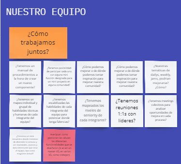
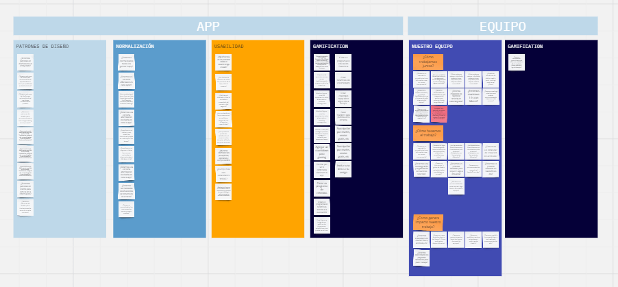
Investigating and spotting pain points in the UX designers team
The UX-UI Designers and UX Writers team was split across several multidisciplinary squads. Each squad handled different features of the application.
For a financial application, one might assume that simply leading all of the experience designers, managing their concerns, and giving them support was enough.
On the other hand, the situation was largely complex. On top of the above, the app had evolved over time in both content and technology, through user feedback, which meant possible new features and user interactions were required.
Analyzing the distribution
Throughout that research, we identified the following pain points:
Consistency
Designers and writers who had no spaces to normalize both design and user experience in the app, and therefore each squad worked by its own criteria, which undermined the consistency and standardization of design and content end to end.
Scattered documentation
Designers and writers who did not have consolidated, validated, and up-to-date visual and technical documentation in one place, and therefore, on different occasions, ran into issues selecting different components.
Design system Zeta
There was only highly condensed design documentation for Zeta, the application’s design system, which not only made it hard to interpret component usage, non-usage, objectives, and more, but also made it impossible for new collaborators to understand the design system’s importance and relevance to the product.
Too many components
A design system with a huge number of components that, in many cases, were similar in both design and interaction, causing confusion even among designers when choosing the right one for the experience. At the same time, some of those components added no real value for the user.
Core Team
Requests for new components to the development team called Core Team (who maintain and develop the bank’s design systems: Lucy and Zeta) that in many cases required substantial development of those components, and on several occasions had no rationales behind them.
Scalability
Challenges in maintaining design scalability and flexibility as the application evolved and adapted to new needs.
Goals
We defined needs and possible solutions
With all pain points identified, the Head UX’s first decision was decisive: we needed to create a Chapter to support and maintain every proposal and any requirements that might arise.
That is when, at the request of the team leads, I joined the UX Design Ops team. First, we consolidated the team with two of the bank’s UX leads, Matias Mariperisena and Diego Pallanch, who chose me for the operational role.
As a second step, we defined strategies, processes, spaces, artifacts, and everything that belonged to the chapter. Once that process was complete — it took approximately two months — we began our execution.
Unified documentation
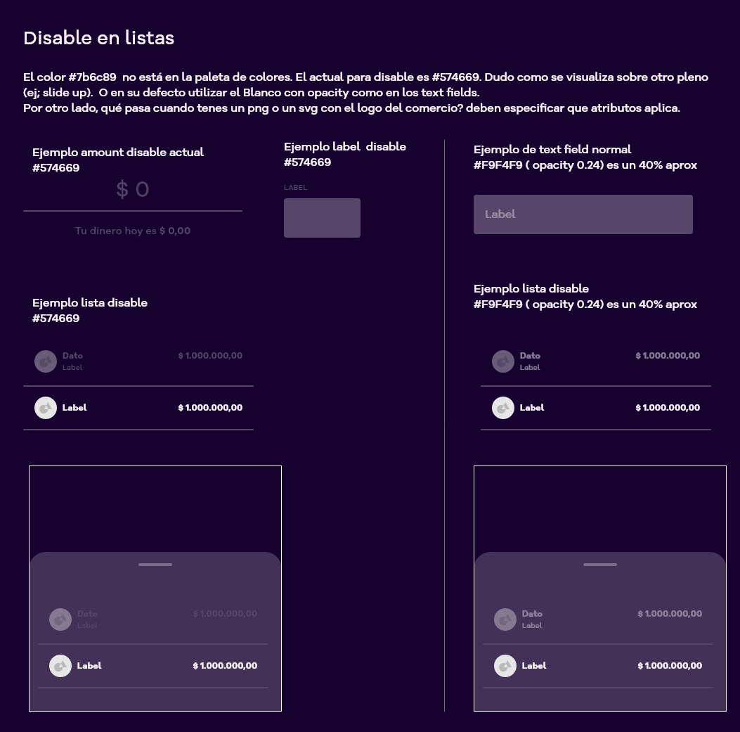
Documentation was sparse and scattered across different files. This was not because designers were disorganized or did not know how to document properly — the reasons were different. When the project started at the bank, the design team was taking in requirements from their squads. Product growth was so exponential, and time to market so aggressive (Argentina’s virtual-wallet boom was just beginning), that the design team had to focus exclusively on requirements. As a result, documentation accumulated in an Adobe XD file with missing rationales, components created with similar behaviors, and states that added no real value to the product. There was no official repository URL where designers could find a complete explanation.
Product consistency
Product consistency was essential to ensure a coherent, consistent, and satisfying user experience. To achieve that, it was fundamental that design teams collaborate effectively, share knowledge, and review one another’s work.
UI Kit in Adobe XD
Redesigning and maintaining a UI Kit in Adobe XD ensured that every interface element was up to date, accessible, and compliant with our team’s design standards.
Requirements flow
Building a UX Design Ops chapter to handle designers’ questions and requests. To ensure UX designers could focus on creating exceptional experiences, it was crucial that they had robust, efficient support to handle their questions and requirements. A process that enabled a request-intake flow, so needs from different stakeholders could be collected, analyzed, and managed systematically.
02 — Process
From research to the chapter
Once the chapter was created, we decided designers needed a structured way to request work from the Core Team (in case it is unclear what the Core Team is: this development team is dedicated exclusively to maintaining and developing all components across all banking products). Once that was in place, we built the following flow.
Understanding and feedback
The UX Designer requested a meeting to present an idea. Identity, consistency, and value are evaluated.
Building the requirement
Template and XD file with variants, states, and use case.
Core Team
Technical weekly; the requirement enters Jira.
Development and DS
Monitoring and publishing in the Design System.
Understanding and feedback
In this first stage, the UX Designer would request a meeting to present an idea. It could be anything from a component, an interconnected ecosystem, a behavioral proposal, and so on.
In this case, we first evaluated whether what was being proposed aligned with the identity of the application, from a 360 view (Components — existing behaviors; Alignment with other features; Consistency; Whether the proposal already existed in the market or was innovative; Development timelines; Complexity of use). We also stress-tested the proposal by outlining possible usage scenarios, coordinating with other UX squads on related features. As follow-up questions, we asked: What is the purpose of this proposal? How will it benefit the user? Does it truly add value to the product? Is there an existing proposal that could solve the same need? How much time is available if we move forward with it?
If the proposal was sound from every angle, we moved to the next stage: assembling the requirement.
Conversely, if the proposal lacked grounding or rationals, we provided correction feedback and returned to the initial stage.
In a few cases, proposals did not move to a second stage because they could be solved with other components or similar interactions.
*A key guideline was to minimize the design system at a functional level. As mentioned in the first stage, this was a major pain for designers, because throughout the product and in its rush, different components were requested that were mostly similar, or that served the same function. As a result, every time designers had to pick a component, they had serious doubts about which ones were most appropriate.
Building the requirement
Once the initial stage was cleared, the designer’s task was simple: build the proposal to present to the Core Team. In the first presentations, designers assembled their artifacts accordingly. Later we optimized that work through a presentation template.
In that presentation we proposed that designers create an Adobe XD file with the request; if it involved components, they should detail the different variants and states, and show the application in a use case.
Just as in the first step, we met with the UXer to review the proposal. If we considered that it included all of the usage and technical rationales, we moved on to the third stage: presenting the requirement to the Core Team.
Otherwise, we flagged possible adjustments for a next approach on the request. In this loop, we sometimes opted for an email with the iterated proposal in order to close this stage.
In very few cases, this second instance reached consensus to deprecate the proposal, because it could be covered by another already established component or behavior.
Presentation to the Core Team
Once the requirement was ready, we moved on to meeting with the Core Team. (In a weekly)
At first, we wanted to test effectiveness. That is why, at the beginning, designers attended the meeting to walk through the details of the proposal to be included. We observed that the sessions were not effective, because the development team essentially spoke in its technical and engineering language, far removed from any experience designer’s glossary, beyond a few already familiar words. We found that the sessions lost their objectives, so we needed to rework and strengthen the proposal.
After understanding the realities, we decided the best path was a small table of people speaking directly in technical language. From that point, the process flowed on its own.
Finally, to close this part of the flow, the Core Team created a Jira card for the requirement with the information assembled in the previous stage.
In the same way, some proposals had to be refactored or reduced, based on development rationales around timelines, complexity, and so on. (These variables were key for designers, because they had to cover that need in one or two sprints.)
Development / Monitoring
In this fourth stage, our work narrowed down to monitoring the requirement. In other words, we acted as intermediaries between the designers and the CT.
As tasks, we tracked the progress of cards in Jira and checked their development status with the CT team.
Publishing to the Design System
Finally, if the development was a success (in every case it was a success—the ICBC C.T. team is a G.O.A.T.), it was added to the design system.
That is where another task began for us: unified technical and visual documentation in a single place.
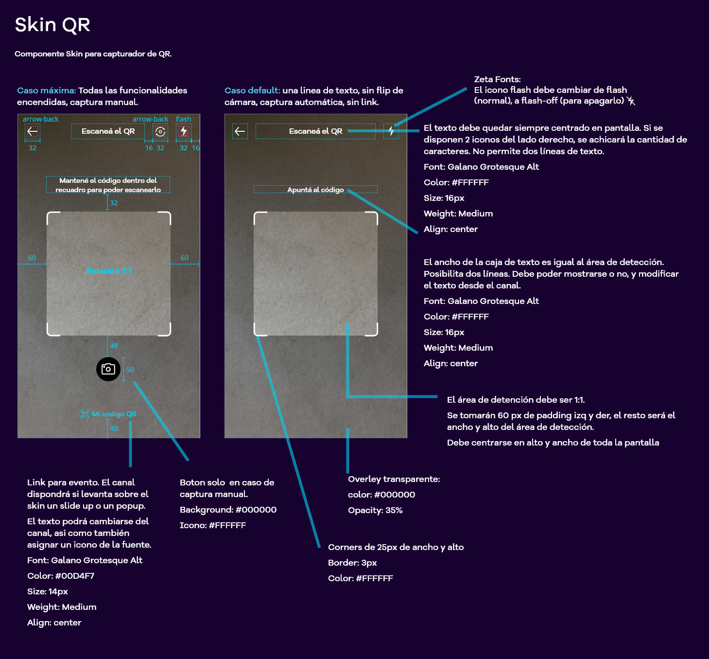
Some examples of how designers documented across different files, in the whirlwind of product growth.

03 — Product
Unifying documentation, jam, and UI Kit
Understanding the pain point, the first task we had to take on was scouting all of the documentation scattered across different files.
That search was by no means easy, because many files lived on designers’ individual drives. This process was slow and bureaucratic, but by the end we had gathered everything that had been documented about components, and everything related to the product.
Documentation template
As a second step, we decided to move into an Adobe XD file to compare and generate a template useful for designers. To do that, we identified a structural pattern that repeated across the different files.
The structure was ultimately organized as follows:
Title and type
The component name and type (Molecule, Atom, other).
Presentation
A brief intro on what the component is and its purpose.
What it is used for
Rationales for the correct use of the component.
How it is not used
Rationales for misuse of the component.
What it is made of
What is the component’s structure (Is it made of other components?)
How it behaves
How it responds to user interaction.
Variantes
If they exist, possible variants of the same component.
Opcionales
On-screen placement, visual aspects (hex-color, border, background-color, border-radius, CSS and JS classes) and related components.
Ver template
Ver template — Dropdown selector, PDF of the 2024 backup.
Repositorio en GitLab
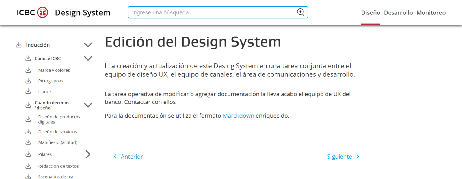
Unifying all information in one place: the Design tab in YOY’s Design System.
As the last part of unifying the technical and visual documentation, we decided that an Adobe XD file was not enough. We received feedback from designers that search was not very friendly, and that with so many components and so many frames, interacting with the file eventually became unusable.
When we saw that improvement opportunity through the feedback, we chose the long, difficult, but successful path: uploading all of the documentation to a GitLab repository.
Design system documentation is most useful when it lives in a repository. That is where everything can be found at your fingertips. Fortunately, the bank already had a website hosting the Lucy repository (the most “bank-like” design system), with a defined structure: a Design tab, where every component lived with its rationales, and a Development tab, with technical implementation and deploy content.
To our misfortune, documenting in GitLab through a virtual machine was torture.
Grab the popcorn, because another odyssey starts here.
Working in a repository is not hard, but it takes technique.
Content is written in a language called enriched Markdown, which is easy to write, is used in most repositories worldwide, and allows a repository to become an encyclopedia of content.
We already knew all of this, but we had an obstacle: the bank’s security.
If you have ever worked at a bank, you will know what I mean. If you have not, let me tell you more. A bank protects its sensitive information (for fair and logical reasons) and all of its data, including email, systems, and more, through a platform that does not live on a public URL, but rather inside a virtual machine. Imagine you had an emulator on your PC and wanted to emulate a virtual machine. This is exactly the same, only with additional security parameters.
Well, the repository we had to upload that information to was inside that virtual machine. Our idea was simply to convert those XD files into Enriched Markdown with CSS for styling. But we started running into complications.
On one hand, converting every document into Markdown is truly tedious and highly mechanical work. After a hard effort, we managed to convert almost fifty components, among other items.
On the other hand, once inside the virtual machine, the GitLab repository tool did not let us select all of the Markdown files and upload them; we could attach only one file. (The bank’s permissions were extremely strict, and multiple uploads were blocked.)
Fortunately, with a happy ending, and after a long effort, we reached the goal: having the documentation in the repository and available for designers to consult.
A space to strengthen the product
This is one of the points that, although more developed, still needed some parameters adjusted.
The design team had been meeting in sessions where they discussed component usage, applications across different product features, and more, but not from a holistic view of the product.
This meant each person, at their own discretion, was designing the user experience, while also running a considerable risk that the application would be inconsistent everywhere.
Our solution was simple and effective, because in previous experience we had faced similar situations: set up UX jam sessions to discuss the points above, always with every stakeholder involved across all features. From a toast to a payment screen, every squad needed to know about a possible change or addition to the design system, and how it would affect their squad with respect to any modification, and so on.
During the first meetings, designers began negotiating some experiences inside the application that were inconsistent. Fortunately, the vast majority of inconsistencies were simply a matter of changing a color or some iconography. Of course we also had some minor changes, but they did not have a negative impact on the application or on users — quite the opposite. After that, the meetings flowed as they had been designed and parameterized.
In conclusion, we achieved a goal that had a simple resolution but was very important to us: getting all designers on the same page when building user experiences.
UI Kit
As the final stage of my involvement in this chapter project, one last piece remained that was no less important than everything above… The UI kit for the application’s Design System.
Something as simple but laborious as rebuilding the component ecosystem in Adobe XD — with its welcome, color palette, icons, illustrations, and components — was vital to finally reorganize all of the designers’ work.
To do that, we split the process into two phases: assessment of the already established UI Kit and of all created components, their variants and states in line with the design system; and redesign of the kit.
UI KIT assessment
This first part of the process was the most labor-intensive, because I had to audit around 50 components, with their different states and variants. Among the major issues, I found what I expected. Inconsistencies in variant names, inconsistencies between component design and what was in the design system, missing states and variants that were documented in the repository, among other problems. After mapping the issues we found through a criticality map, we got to work.
Kit redesign
The first thing we started working on was correcting the components. The change was key: fix inconsistencies and errors, and update so that all of the designers’ prototypes were up to date.
Hard design and masters
But… what if designers “hard-designed” the components with other colors and other styles?
The solution was simple: we created a backup version of the file, made the changes, updated it, reviewed each designer’s masters, and… voilà! We found only about 10 components that “broke” the designers’ prototypes as a result of modifying the parent component.
With every component already corrected and consistent with the repository, the next step was to bring the kit to life.
This was the crowning achievement of a joint effort within the chapter, bringing the YOY designers’ UI KIT to life.
04 — Outcomes
Creando valor desde distintos frentes
UI Kit, documentation, and liaison with the Core Team, adding value to the product through the automation of flows and processes.
↑25%
Reduction in the team’s execution times.
↑20%
A 20% saving in process times.
UI
Qualitative improvement across the entire product based on UI consistency.
Other metrics
Greater designer satisfaction from having the necessary tools.
UI KIT
Improve designers’ efficiency and velocity.
Documentation
Technical and visual documentation unified in one place.
Core Team
Interlocutor entre UXers y Core Team.
Product
Product value through the automation of flows and processes.
Conclusion
In conclusion, we achieved a goal that had a simple resolution but was very important to us: getting all designers on the same page when building user experiences.
Fortunately, with a happy ending, and after a long effort, we reached the goal: having the documentation in the repository and available for designers to consult.
Thank you for reading!
Other cases
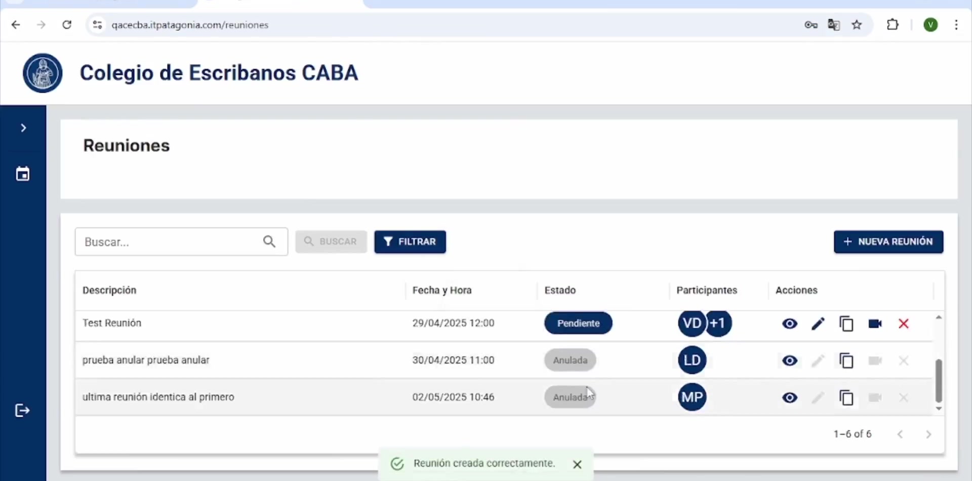
CECABA Digital Signature System

Design Ops — Full initiative
OPTI
Cannect Mobile
Cannect
RUBI – GCBA
ICBC Auto Pledge Loans